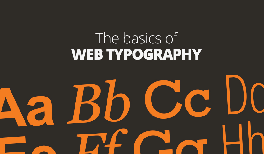
They say imagery is key to good web design. But what about the often forgotten art of typography?
First of all – what is typography? Well, put simply, it is the arrangement of letters in order to aid communication. It’s been around for centuries but there’s no doubting its web form is still very much in its infancy.
Unlike print typography, the web-based variant doesn’t benefit from quite the same level of control, therefore what you do with letters and numbers on the web is largely defined by the limitations at hand. It’s all about getting the basics right.
Serif or sans-serif?
We don’t read individual letters. As you’re reading this blog post, your brain is recognising word shapes. For that reason, if you jumble up the letters within a word, they can usually still be read, without noticing the misspelling. This brings us onto serif and sans-serif fonts. The former places lines at the end points of letters to further define them – the latter doesn’t. People will tell you sans-serif works better on the web because, once you start cranking down the font size, detail gets lost. That’s a flawed argument, however, because now we know that we don’t read individual letters. Thus both types of typography work just as well. Georgia and Sabon are great web fonts and are both serifs.
What about the typographical scale?
The scale was developed in the 16th century and runs as so: 6, 7, 8, 9, 10, 11, 12, 14, 16, 18, 21, 24, 36, 48, 60, 72. It is still used in modern-day design applications and refers, basically, to a standardised sizing of fonts.
However, there can be variances in the sizes with different fonts (you’ve probably noticed this when using word processing applications), therefore it isn’t a rule you should live by.
By-and-large, if it looks right, it probably is. Don’t worry too much about the numbers.
Testing with multiple fonts
We’d always advise against this. The time to get your font right is at the start of the design process. Pick one and stick with it. Build your site around it. If you find yourself changing fonts throughout the process or once the site is fully-designed, you’ll likely have to start all over again.
Should I use free fonts?
An easy answer, this. If it looks right – use it! Don’t worry about whether or not the font was free or paid for. What matters is how it communicates your central message. If it does the job, then the price you pay is irrelevant (and all the better if it’s £0!).